Colour trends 2023
Welcome to the 2022-2024 Taubmans Colour Report - a celebration of bright, bold colours at a time when their positive influence is needed most.
At Taubmans, we started out in 2020 with an entirely different colour forecast in mind. We looked to international colour and design trends and started to build a palette and narrative. Then COVID-19 changed everything.
Our colour work seemed irrelevant and felt disingenuous. So we stopped and took the time to think about the most useful thing we could do as a paint company in these challenging times.
Historically, economic factors have influenced design trends - from the Great Depression, when designers responded to weak discretionary spending with brighter, more colourful products to catch the eye, through to the 2007-08 recession, which gave us ‘start-up minimalism’. Pinterest, Instagram, Uber, Warby Parker, We Work and Airbnb, to name a few, all grew out of this recession.
These start-ups that came into the market needed to demonstrate to corporate America wary consumers that their value lay in their products and not in heavily styled marketing campaigns, which concealed a thin reality - that they were transparent, their costs were as minimal as they could be. Simplistic start-up styling became popular in interiors for hospitality and commercial settings, with white walls, reclaimed timber tables, hanging Edison bulbs and very little ornamentation.
The result was a mix of rustic Scandinavia and Industrial that made the transition from a We Work space to a café a seamless experience, but a disheartening journey through spaces that provided little nourishment to our senses. It’s curious to note that this look became so ubiquitous; it may as well have been a style guide for all those fiercely individualistic start-ups. The trickle-down to domestic interiors of pared back spaces, bright white walls and timber are still evident today.
Maybe as a foil against this reductive aesthetic of the post-recession period, we went swinging the other way to rich, deep wall colours and jewel toned furniture, which were frequent guests in many interior design magazines and blogs. I loved seeing colour used, but felt it was potentially intimidating to think about painting your entire living room dark teal and that painting every element in the room the same colour - from ceilings to skirting boards - was an affront to any architectural detailing, which got completely lost in the process.
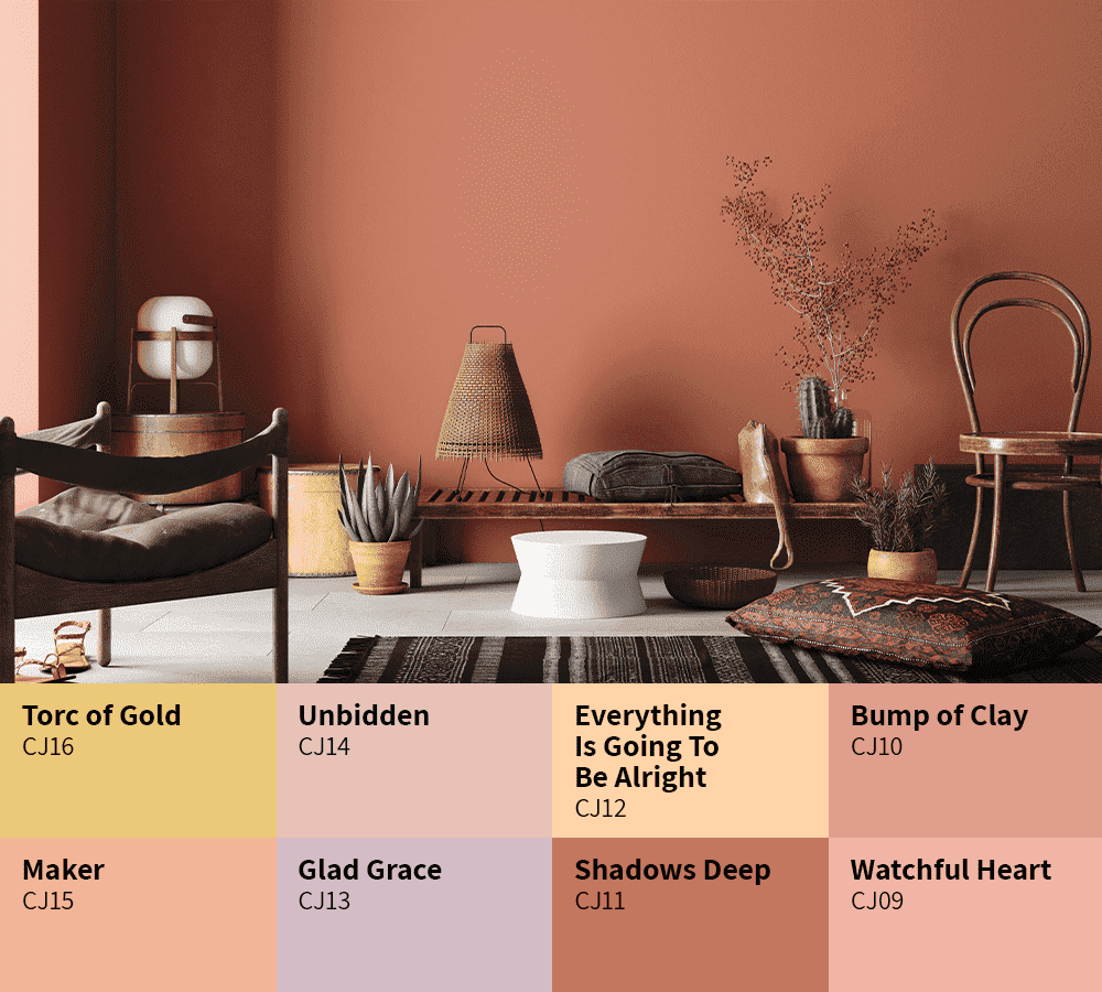
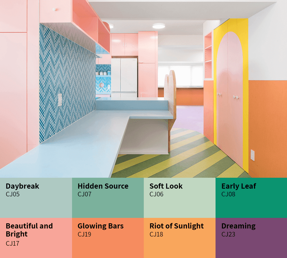
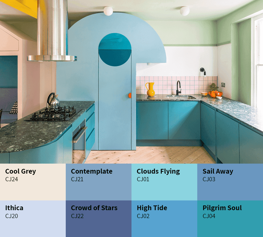
The Taubmans Chromatic Joy colour collection boasts 32 entirely new, home-grown paint colours created using the Taubmans Coloursmith Reader. Chromatic Joy espouses the positivity of bright, bold colours while being anchored in lightness, making it easy to incorporate into any setting to imbue a sense of joy and a comforting containment.
In homage to the late Derek Mahon (1941-2020), whose poem ‘Everything is Going to be All Right’ (1979) has found fresh prominence during the COVID-19 pandemic, the Chromatic Joy hues were named from verses of the poem using the cut-up technique, in addition to the poems ‘Lives’ (Mahon 1972) and ‘When You Are Old’ (Yeats 1891). These times are unprecedented in modern history with such loss of life, of livelihoods and immense personal sacrifice. Australia has endured so much, from the catastrophic bushfires that saw in the New Year to the global pandemic that followed. In Australia and New Zealand, communities have banded together to support those in need and care for one another. In the ongoing Covid-19 pandemic, we continue to work together to keep our families, our colleagues and our communities safe. In the face of crisis we have learnt to put ‘we’ above ‘me’ and to value the collective good before individualism. As we continue to traverse strict social restrictions and face a changing world, the need for air, for joy, for lightness, for happiness and for social connection has never been so pressing.
Looking ahead, we see these themes emerging in global design trends like New London Fabulous, with nods to the Memphis Design Group and the bright, boldly patterned and eccentrically shaped designs of the 1980s. In Australia and New Zealand, the pared-back, bright white spaces of minimalist design make way for comforting and joyful colour, creating emotionally nourishing environments. We see the deliberate infusion of colour evolving to promote and sustain a sense of wellness within the built environment. White is not the absence of colour - a shaft of sunlight contains all the colours of the spectrum. Combined, we see white light. The ‘White Light’ palette of carefully curated whites ideally complements any combination of the colours of Chromatic Joy, providing balance and harmony in equal measure.
You may be familiar with the sensation of returning to Australia or New Zealand from the Northern Hemisphere and being struck by a light of shimmering clarity and brightness. In this change of light there is an enhanced awareness of colour. There is no pure white colour in nature. The White Light whites are all tinted with a mix of pigments adjusted to give either a cool, warm or neutral effect; inorganic pigments provide coverage and soften the colour, while the more transparent organic pigments provide luminosity and a multicoloured dimension to the surface. We could not imagine a world without colour. Colour is not the inherent property of light or physical objects; it is our individual, subjective interpretation of wavelengths of light that determine the colours we see. Colour is an integral element of our world and plays a vital role in our well-being. The relationship between how we think about colour and how we physically react to colour is a new science. Neuroaesthetics is a fascinating new field of scientific study, which aims to investigate the “perception, production, and response to art, as well as interactions with objects and scenes that evoke an intense feeling, often of delight.” It is our subtle responses to colour that make us human.
At last year’s Salone del Mobile, Google partnered with John Hopkins University’s Arts + Mind Lab to put the theory of neuroaesthetics to the test. ‘A Space for Being’ was a multi-room experience; visitors were fitted with a band that measured their physiological responses as they moved through three spaces, ‘Essential’, ‘Vital’ and ‘Transformative’. One of the interesting findings was a disconnect between how a visitor claimed to feel in a certain room versus what the data revealed they were feeling. Ivy Ross, VP of Product Design at Google, who led the project said “We’ve been optimising our environments too much for our cognitive mind in recent years, and we need to ignite our senses and bring more awareness to what feels good rather than what we think.”
Perhaps we need more joy, more playfulness in our spaces. Ingrid Fetell Lee’s Ted Talk, ‘The Aesthetics of Joy’ is a persuasive argument for the use of colour in the built environment. Chromatic is any colour in which one particular wavelength or hue predominates. For example, blue and green are chromatic colours. White, grey and black are achromatic colours that have no dominant hue (all wavelengths are present in equal amounts within these colours). Joy is the emotion of great delight or happiness caused by something exceptionally good or satisfying; keen pleasure; elation. Chromatic Joy is the delight we take in colour consciously or subconsciously.
Rachel Lacy
Chief Coloursmith
Taubmans PPG Australia

 Back to Colour Together page


