SHARE

Colour inspiration can be drawn from anywhere including your favourite artists. Aside from their obvious talent and vision, certain artists' relationship with colour is something that has aided in continuing their notoriety and relevance years later. When looking to create colour palettes for your own spaces, a wonderful way to visualise how certain colours work together is by channelling those used by famous artists like Calude Monet, Vincent van Gogh, Pablo Picasso and more. Learn how you can use these colour palettes for your own projects.
ANALOGOUS COLOURS
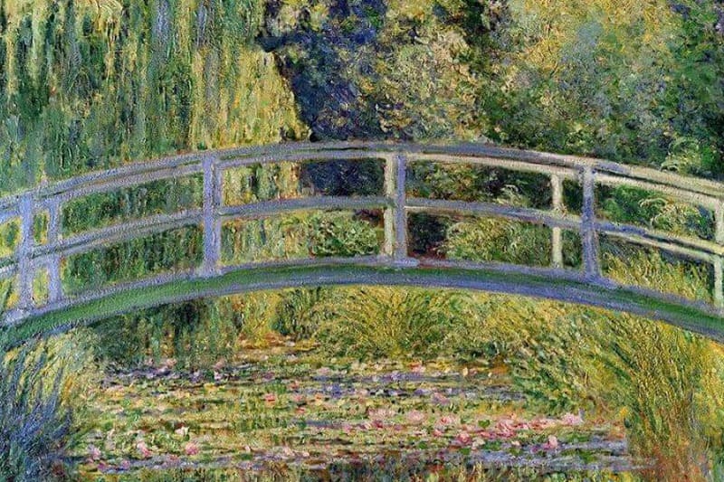
Claude Monet was a French artist known for his work in nature – most famously the Water Lilly Pond. Taking inspiration from his own lily pond, Monet often used Analogous colour schemes throughout his paintings. Analogous colours are colours that sit next to each other on the colour wheel. This tried and trusted colour scheme is one that frequently occurs in nature and is easy to visualise and recreate. Examples of Analogous palettes include blue-green, green-yellow and red-orange. We suggest viewing Taubmans' green shades for inspiration.
COMPLEMENTARY COLOURS
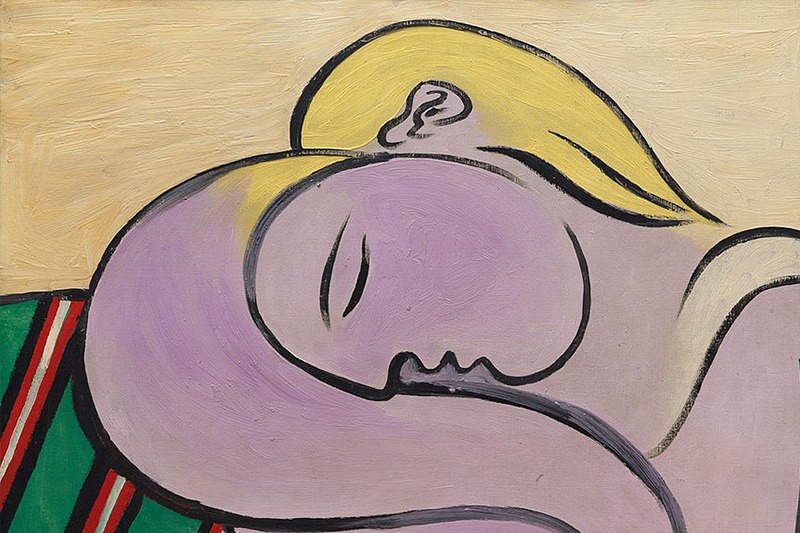
Inspired by more vibrant colours? Artists like Pablo Picasso, Henri Matisse, and Georgia O’Keeffe are all known for their use of Complementary colours. These are colours that sit opposite to each other on the colour wheel. For example, Pablo Picasso's Woman with Yellow Hair plays with yellow, red, and green with accents of neutral colours of white and black.
When playing with bold colours that are opposite to each other on the colour wheel, breaking them up with neutral tones helps to unify the palette. If you want to see how your complementary colour palette fits in a room, use our colour visualiser here.
WARM AND COOL COLOURS
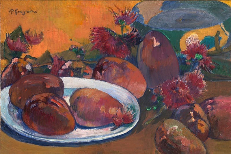
When looking to transform your home, people often think about what feeling they want a space to evoke. The common feelings that come to mind are cosy, welcoming, and warm. Warm colours include red, orange, and yellow. These colours are used to inject energy and make a space pop. On the opposite side of the spectrum, cool colours create a calming energy. Cool colours include blue, green, and purple. The difficulty lies in striking a balance between the two colour schemes. Unsure how? Look to Monet's The Artist’s Garden at Giverny, Paul Gauguin's Still Life with Mangoes, or Vincent van Gogh's Sunflowers. The balance is found by choosing a primary tone and adding pops of colour.
NEUTRAL COLOURS
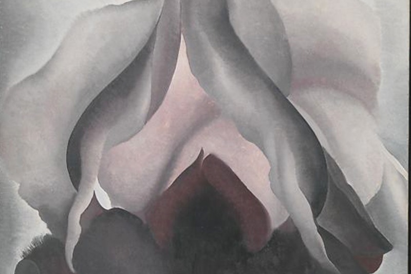
Neutral colour palettes are extremely popular due to their classic and timeless style. Neutral colours are created by mixing sets of Complementary colours together with white, black, or grey to make varying shades of brown. Examples of neutral tones include grey, brown, tan, beige, white, and black. Art from Georgia O’Keeffe's Black Iris and Camille Pissarro's Place du Théâtre Français, Paris: Rain are two stunning examples of neutral colour palettes that can be easily replicated in your homes or craft projects.
Don't be afraid to draw your colour inspiration from the winning combinations of established artists to bring your spaces to life. If you have selected your inspiration and want to begin ordering paint, try using our Coloursmith app and tools to match colours from any image. Get creative and happy painting!