SHARE

A quick guide to which colours to use for your best night’s sleep
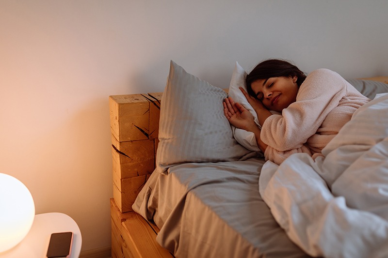
Sleep is a critical factor in maintaining our physical and mental well-being, so trying to optimise our sleeping environment is always a good idea. When designing the look and feel of your bedroom, you may jump at certain colours and shades based purely on their aesthetic appeal. While there is zero shame in doing this, if you are someone who struggles with getting to sleep, some colours can help you relax.
Don’t have time to study colour psychology in depth? Don’t worry because here’s a quick guide to which colours to use for your best night’s sleep.
Blue
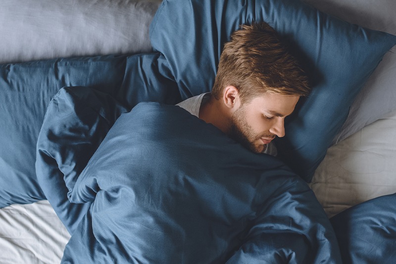
The best colour you can use for your bedroom is blue. A range of studies has listed blue as the most calming colour due to its soothing effects on your heart rate and blood pressure. How does blue do this? Our eyes contain specialised receptors called ganglion cells that are most sensitive to the colour blue. These cells filter and send information to the part of our brain that controls your body's 24-hour rhythm. A recent study of 2000 Travelodge hotels found that guests who woke up in blue rooms got the highest amount of uninterrupted sleep, compared to other colours at 7 hours and 52 minutes. This is impressive considering the average person rarely gets 7 hours of uninterrupted sleep.
While all shades of blue can evoke a relaxing mood, if you want to give the appearance of a larger room, opt for lighter shades on your bedroom walls and ceilings. We recommend colours like Taubmans’ Dim Night or Formosa Blue.
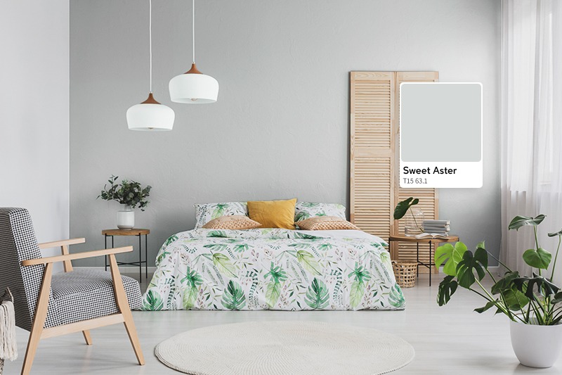
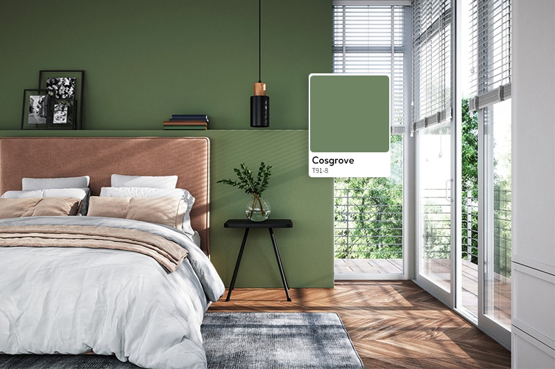
Green
If getting out into nature relaxes you, why not incorporate nature’s tranquility into your bedroom colour palette? Creating a space that mimics nature is a sure way to tuck in and soothe yourself to sleep. Fresh greens are known to bring harmony to the room. Check out colours like Taubmans’ Fountain Mist, Dark Velvet Green or Pine Ridge.
Avoid glossy paint
The sheen of your paint will play a major factor in terms of sleep quality – no matter which colour you choose. Anything that can reflect light and stimulate your sense will be a detriment to your sleep quality. An overly glossy finish can reflect light and stimulate your brain, so opt for a matte or low sheen finish instead.
Colour to avoid in the bedroom
As a rule of thumb, vibrant colours such as reds, oranges and loud pinks should be avoided in bedrooms. This is due to these energetic colours being stimulating to the eye. Some studies have shown that looking at the colour red increases your heart rate and adrenaline flow. In the wild, reds, oranges and yellows are considered dangerous colours and instinctually make us more alert when we see them – the last thing you want when you’re winding down for sleep. If you simply must have a vibrant colour, consider a more muted version.
If you’re trying to give yourself the best chance at a good night’s sleep, make sure you create a soothing retreat that isn’t overly stimulating to the eye. To create this sleep time oasis, seek out the relaxing blues, greens and matte finishes. Get creative and happy painting!