SHARE

5 TV Shows and Movies to Inspire Your Home Colour Palette
Decor inspiration can come from anywhere, but sometimes your favourite movies and TV shows just nail the exact aesthetic you’ve been looking for. To kick off your celluloid décor inspiration, we have put together five mood boards from distinctive looking shows and movies — no set designers required!
Moonrise Kingdom
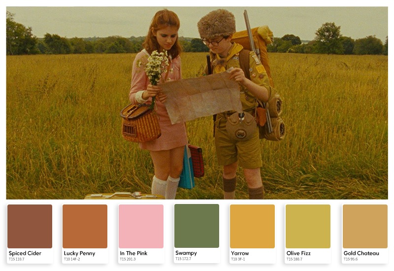
The use of greens, browns and soft yellows in Moonrise Kingdom is pleasing to the eye and sets a tranquil mood, easing the viewer into scenes gradually to offset the stilted nature of its characters. The colours rarely contrast, blending into one another to give a sense of dreamlike airiness with their shifting gradients. The use of analogous colours in the film creates a sombre but nostalgic mood in line with the narrative by borrowing commonplace colours from the films of yesteryear.
In lighter moments, the pastel colour schemes in Moonrise Kingdom make the world feel more pleasant and optimistic—guiding the viewer’s emotional focus to hit the high notes needed, letting colour alone do much of the heavy lifting.
For a similar effect try Lemon Spread. If happiness was a colour, it would be yellow! Yellows infuse your spaces with a warm inviting energy throughout.
Her
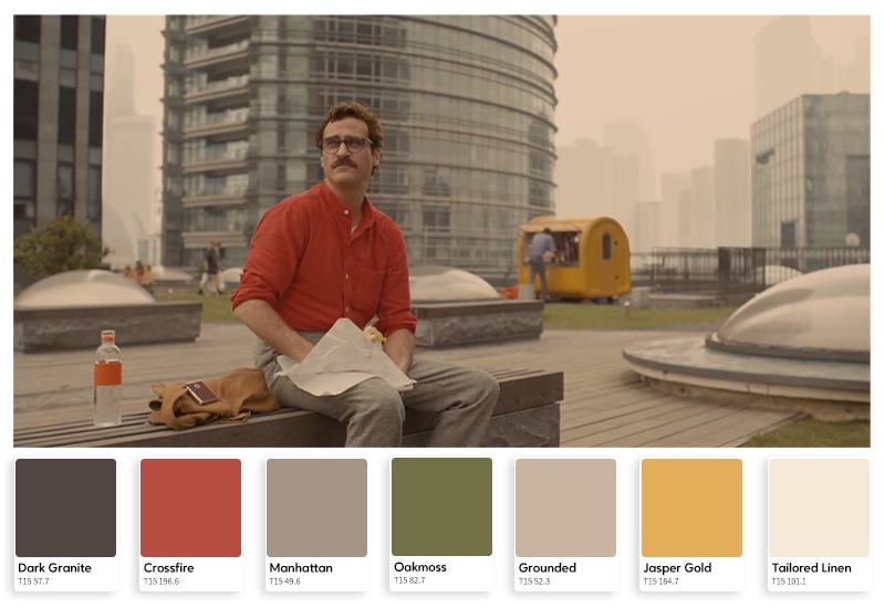
The sci-fi movie Her departs from many conventions of the genre, selecting a primary palette of earthy reds with a sandstone colour grade that permeates every scene.
The typical electric blues and neon splashes that are mainstays of science fiction take a back seat to the more natural hues here, accentuating the unique balance between technology and humanity that the film explores.
Colours darken as the story progresses, deepening with the narrative to evoke a foggy ambience of confusion and dreamlike wonder that reflects the main character’s ongoing inner turmoil.
Want to incorporate HER? Our Goddess Collection features a range of earthy reds and complimentary blue-greens inspired by unique colours of the natural world.
Mad Men
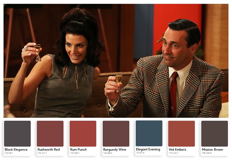
Creating the look and feel of a specific period in history, particularly one that’s recent enough for some viewers to remember, can be a fine art.
Authenticity is obviously key. The textures, décor and trinkets of an era with some of the most distinctive items in these categories provide enough of a visual cue to the audience to immediately know where these characters are placed in history.
Mad Men does something additional with its colour palette, elevating the look and feel of its environment with a classy, subtle and distinctive blend of classic hues that may have been out of vogue for decades, but somehow look brilliant.
This “old is new” remix approach gives the series a unique aesthetic, like a time capsule preserving the crisp freshness of colours we’ve previously only seen faded and peeling in the real world.
Go neo-retro: With Coloursmith you can create your own unique colours using old photos as the reference palette for a fresh coat of paint.
Star Wars
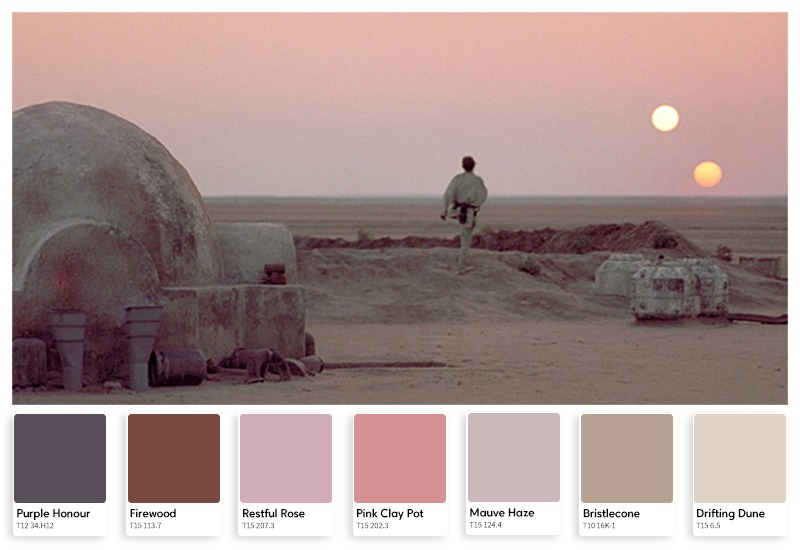
Star Wars has a lot happening—both onscreen and off. It was held up as an example of filmmaking for its use of special effects and storytelling, defining its genre with a string of sequels and spinoffs.
Often overlooked amidst all the lasers and robots is the craftsmanship that went into its cinematography. It is driven by a carefully chosen colour palette of purples that fade to red and blue at the edges, interrupted often by strobing splashes of neon colour in dimly-lit spaces.
Glowing blue and grey spaceship interiors are nicely juxtaposed with the warmer, sandier colours and atmospheric reds, blues and purples of Luke Skywalker’s desert planet.
Hero’s Journey: Even space knights need the right paint for the job. With two suns beating down all day, any desert moisture farm exposed to the elements should have a coat of Taubmans All Weather Exterior.
24
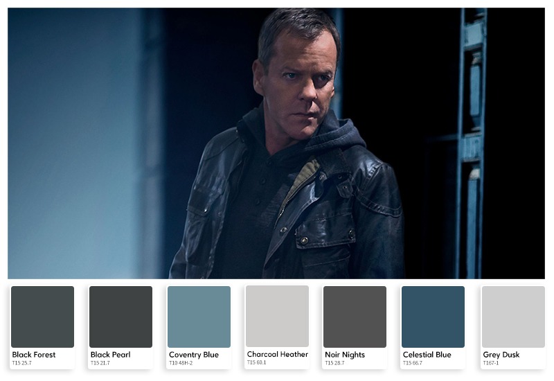
We spend a lot of time trying to find ways to make our living environment tranquil, pleasant to be in, and a place where we can relax. But maybe that’s not what you’re looking for. Perhaps your work or lifestyle demands that you have cat-like reflexes and sleep with one eye open, always remaining both alarmed and alert. Well, there’s a TV show-inspired palette for that too.
In the long-running TV series 24, set designers went with a gradient of Black Forest, Black Elegance, Black Pearl, Canyon Black, Black Night, and All Black. Accenting this inky atmospheric spread are Charcoal Heather, Grey Dusk, and Noir Nights—layered with alternating textures of carbon fibre sheeting, black iron grating and chrome railing to telegraph a foreboding sense of impenetrable security.
Investigate Now: Step into a world of colour possibilities with Taubmans at a store near you.
Let the inspiration flow and happy painting!