SHARE

“Carefree confidence and a daring curiosity that animates our creative spirit, inquisitive and intriguing”
Introducing Very Peri — the Pantone colour of the year 2022.
Pantone has created a new colour in their 23 years of Pantone Colour of the Year program in 2022. This fresh, spirited colour can inspire you and make your world full of possibilities.
Every year brands across industries wait for Pantone to announce their colour of the year and are quick to offer a range of merchandise inspired by the colour. Since the announcement in early December 2021, this colour has made its way into the local stores across the world. It is hard to overlook this vibrant colour. There is a good chance you have already picked up a thing or two in the Very Peri shade. We want to ask you: Does Very Peri inspire you? Are you willing to take this colour indoors, transforming your living space?
Are you on the fence?
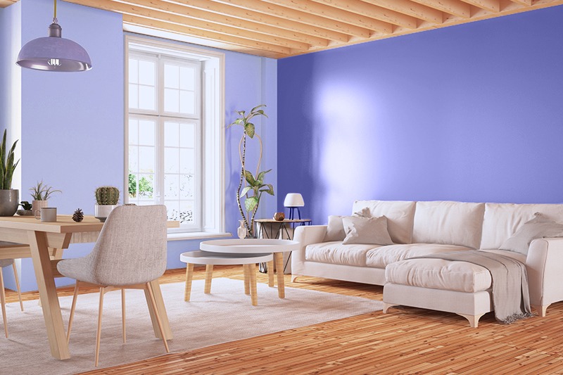
Very Peri may not be a colour for everyone. However, this colour is perfect for doing up a nursery or a kid(s) bedroom for a soothing influence. The kid(s) will love it.
Use Taubmans Colour Visualiser to virtually paint any room in your home and see if it appeals to your taste. It is a simple 4-step process. Start by uploading a picture of the room you want to paint and choose your colour. As soon as you press the Paint your room button, your Very Peri room will appear on the screen. It is a free tool, so have a play for a better way to see what suits your taste and go for it with confidence.
Very Peri in 2022
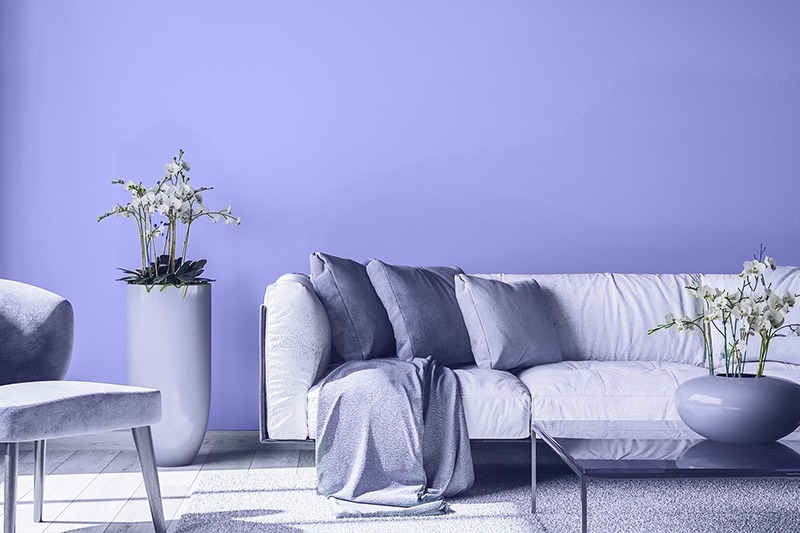
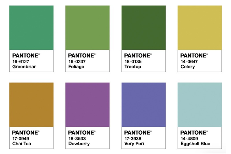
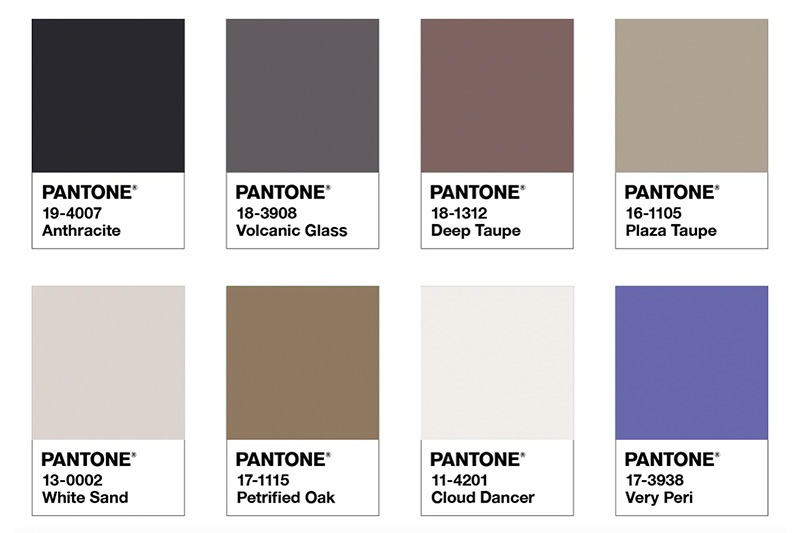
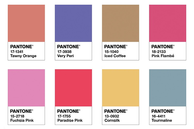
Interior decoration, wedding colours, corporate branding, wardrobe, or painting walls, Very Peri pizzazz is sure to create a bold statement. If you are looking for inspiration on colours to pair with this dynamic periwinkle blue hue with a vivifying violet-red undertone in your home, be sure to look at Pantone’s recommended colour palettes:
• Balancing Act: Intensified Very Peri injects a feeling of liveliness and visual vibration. The warm tones support and enhance each other.
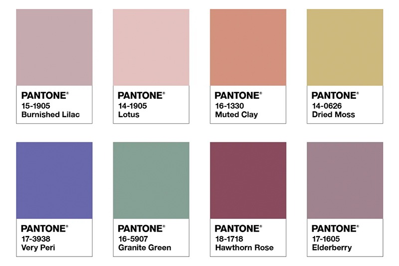
• Wellspring: Highlights the compatibility of the greens and creates a holistic and harmonious blend of nature-infused shades.
• The Star of the Show: A palette of classics and neutrals, when paired with Very Peri, convey a message of timeless sophistication
• Amusements: A joyous and whimsical colour story of irrepressible fun and spontaneity amplifies when paired with Very Peri's carefree confidence and joyful attitude.
Reference: Pantone
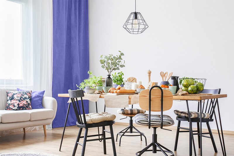
Don't want to go all out? There are many ways to transform the indoors into one full of possibilities. Start with subtle changes if you want to be on-trend without the commitment. Try out Very Peri coloured linens, curtains, painting or coffee mugs.