SHARE

No-one can ever have enough joy in their life - which is why Joy is one exhibition you don’t want to miss. Open until 29 August 2025, you can experience a vivid and emotive journey where creativity, colour and storytelling intersect. Taubmans is the proud Colour Partner of the exhibition which showcases how seven leading creatives were able to capture the essence of joy.
Immersive and interactive, this exhibition appeals to all ages with its sense of fun and different perspectives on the power and meaning of joy. From big, overtly joyous moments to more reflective spaces, and carefree childhoods to celebrations of belonging and togetherness, every installation allows you to explore what joy means to others and how this sparks joy in us.
Taubmans’ colours of joy
Stories can be told in many ways. And the choice of colours used by storytellers, from painters to filmmakers, is rarely random. Colours are chosen specifically to evoke a mood, portray personality or symbolise powerful emotions. Because colour tells us stories in ways that are both conscious and sub-conscious.
Colour was integral to conveying what joy meant to each creative and how they wanted to share their story. The artists selected the colours from the Taubmans range and not only conveyed joy, but also demonstrated how colour can be used in both subtle and overt ways to inspire our emotions.
Green
Also anchored in nature and representing renewal and rejuvenation, the cooler blue-tone green of Taubmans Clover Hilltop was popular with the artists, showing its versatility as a collaborator or the main event
While the more mustard tones of Taubmans Gold Strike were used to enhance vivid colour combinations.
Yellow
Unsurprisingly, two paints were chosen from the Yellow family, a colour that sings happiness and instantly brightens any space. Taubmans Sun Valley brings a punch of bright sunshine.
Orange
From the orange family, with its sense of playfulness, the softer red tones of Taubmans Peach Shortcake give a sense of comfort and provide a perfect foil to many of the more powerful colours used. The vibrancy and energy of Taubmans Mandarin Orange features in a number of installations as a pop of colour or as a strong statement.
Blue
Highly versatile, nature-inspired blue was popular with five paints chosen. From the calm purity of Taubmans Clinton Blue, to the deep sophistication of Taubmans Blue Lagoon.

Red
Our range of reds, from flirty to fiery, can be used invoke everything from a soft warmth to a powerful vitality. In the artists’ hands, Taubmans Red Glow and Taubmans Renegade were used in a number of ways that ranged from the dramatic to the nostalgic.
Taubmans Handsome Royal, and the soothing true sky brightness of Taubmans Garter Blue to punchy Taubmans Bright Cerulean, these colours have been used as the main event or as highlights.
Purple
Also featuring in a way you cannot miss, is Taubmans Windsor Purple. Purple is usually a feature colour. In Joy, it used in both a soothing and calming way, as well as a vibrant expression of power.
Seven artists, seven joyful experiences
Stories can be told in many ways. And the choice of colours used by storytellers, from painters to filmmakers, is rarely random. Colours are chosen specifically to evoke a mood, portray personality or symbolise powerful emotions. Because colour tells us stories in ways that are both conscious and sub-conscious.
In each of these installations, colour is integral to conveying what joy means to each creative and how they want to share that with you.
Nadia Hernández
In Que te peudo decir, asi son las cosas, Venezuelan-born Australian artist Nadia Hernández proposes that joy can be found in ‘cotidianidad’, or ‘everydayness’. These everyday moments revolve around the kinds of food and music that evoke joy.
Spencer Harrison
Strut your stuff on a joy-inducing runway by Queer artist, Spencer Harrison. Bring It to the Runway, Runway ‘drags up’ the Museum’s architecture with a play of colour and light that celebrates all identities.
Nixi Killick
Globally renowned ‘future positive’ fashion designer Nixi Killick invites you to use her vibrant, interactive Joy Generator. It fuses colour, technology and augmented reality to ignite joy. You’ll find it hard to tear yourself away.
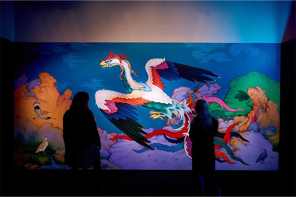
Elyas Alavi with Sher Ali
“We were really fascinated by the variety of the colours that we’d been given and the paint quality as well. It was really strong and easy to cover the surface and the colours brought joy to the whole room.”
In Search of the Simurgh by Afghanistan-Australian visual artist and poet Elyas Alavi with Sher Ali uses colour to explore the connection between the epic story of this Persian mythical bird, and the resilience, strength and joy of migrant and refugee experiences.
Their use of colour is very intentional and connect with the work’s mystical origins. “Yellow is a joyous and spiritual colour, while blue is between here and heaven”, says Elyas.
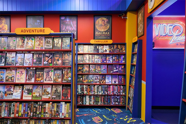
Callum Preston
“Colour is definitely a huge element of this store. I was working with the Taubmans colour palette and we were able to create a space that feels all-encompassing. Although we are in a gallery, it really does feel like we’ve picked up the space from the nineties and dropped it directly in the museum.”
Video Land by multi-faceted pop artist and designer Callum Preston allows you to experience the joy of nostalgia at this replica of the video store, a 1990s mainstay.
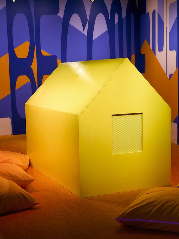
Jazz Money
For Wiradjuri artist and poet Jazz Money, “I think colour has an emotional impact on people, I feel very affected by colour. And so the colours in the blues and oranges, I just think they really pop and they make this sort of optical illusion with the colours and the patterns that I think is quite immersive and really invites audiences in to think about the space.”
In Our Laughter Will Become the Waterfall, a soundscape of laughter and care enfold us, while a mural referencing the waterfall that once flowed with laughing waters on the Birrarung Marr surrounds us.
Jazz’s favourite colour is yellow, and she immediately wanted to have a little yellow home. ‘A place to house sunshine and joy. Everything good to me is in yellow’.
Beci Orpin
“Colour’s always been really important to my work and definitely I think colour relates to joy quite a lot. I’ve used tones which are a bit more late-70s, early-80s.”
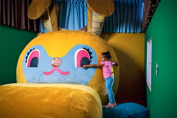
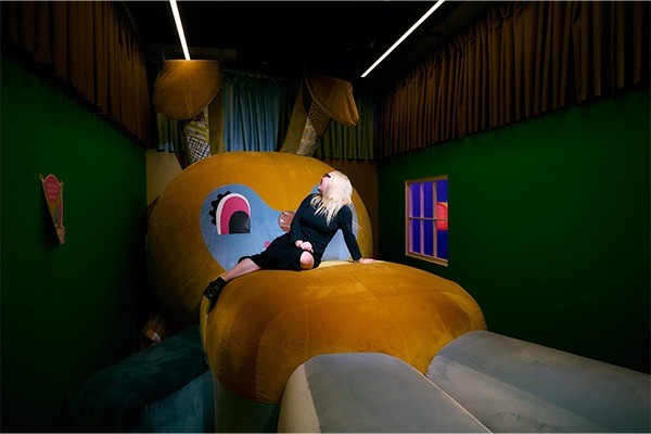
Celebrated local artist, Beci Orpin, uses colour to invite you to relive your childhood with Bunny Dearest. It’s a chance to go back in time to re-live the all-encompassing sensation of childlike joy that hugging our favourite soft toy gave us.
Share your joy
These seven artists aren’t the only ones who can share what evokes joy for them at this exhibition. You can also make your own mark by sharing what sparks joy for you at the 'Share Your Joy' wall at the Museum.
If you’re inspired by the colours used in Joy, why not start playing with a fresh new look at home? As the colour partner for Joy, Taubmans is immersed in colour every day, helping people create their own sense of joy in their homes.
We understand how a pop of colour, a feature wall or even just upscaling old furniture can transform a space. If you’re looking to bring a little Joy into your home, these are the Taubmans colours featured in the exhibition. Order a colour pot today!