SHARE

Painting your home can be a joyous experience — it’s made all the better by adding a splash of colour.
Taubmans colour specialist Rachel Lacy says there’s not a singular colour or shade that’s currently in vogue.
“There is no one trend exactly,” she shares. “The trend is simply towards colour in general — the trend is ‘just not white’!”
After 30 years in the industry, Rachel has found that home colour trends move in decades as opposed to years — so, shifting back to stark white walls isn’t going to happen any time soon.
With that in mind, here are some of the most popular colours trends for your living room, going into 2022.
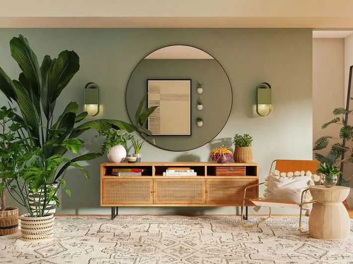
Sage green has proven to be a popular shade in recent years. Picture: Unsplash
All kinds of green
People can’t get enough of green, Rachel says.
“If we’ve just had a decade of beige, I think we’re going to have a decade of various greens, from the bright, stronger greens, to the softer colours, like eucalyptus,” she says.
Sage green — a pale, dusty shade of green — has shown broad appeal, she says.
“[Sage green] seems to be the safest choice for people who want colour, but maybe don’t have the confidence to go wilder,” she says.
Within Taubmans’ Chromatic Joy palette, which catalogues the trending colours of 2021 and 2022, Rachel recommends ‘Daybreak‘ for a pale green and ‘Hidden Source‘ for those willing to try something darker and bolder.
 A gelato palette can be a mixture of pastels, bold and neutral shades. Picture: Unsplash
A gelato palette
Along with sage green, you’ll find more pastel shades, ranging from light and bright to more muted.
“It’s just like what you would see walking into an Italian gelato shop,” Rachel explains. “There are rows of clean, pastel colours and those slightly dustier colours. They both have equal space in the market.”
On the one hand, you might have a bright mango or deep coffee, then you might have more muted pistachio, banana, peach or macadamia.
“You have two options here: you can go for those more lively, bright, pastel, gelato colours or for the safer, slightly dustier, sage greens or muted blues,” Rachel adds.
Memphis Milano would call for bold, contrasting colours, whereas this pink and green palette is much more muted. Picture: Taubmans
‘Muted Memphis Milano’
Memphis Milano was an eighties trend of bright, clashing block colours in mostly geometric patterns. Rachel believes we’re seeing this style return, but with dusty or muted tones.
“[In the Memphis Milano style] you would see a lot of colours together that are opposite on the colour wheel — so, you would see a lilac next to a yellow, for instance,” she explains.
Some examples of colour wheel opposites could be:
- Red and green
- Pink and green
- Blue and yellow
- Blue and orange
This can be quite a leap for anyone new to playing with colour and can be quite stark. However, when married with the trend of muted, dusty and pastel tones, it can be a lot more palatable.
Side-by-side colours might be red and orange, pink and red, or blue and green. Picture: Unsplash
Side-by-side on the colour wheel
Alternatively, Rachel says we’re also seeing colours paired together that are right next to each other on the wheel.
“You’re seeing a lot of colours that sit next to each other, especially in Europe,” she begins. “So you’ll have a soft lilac next to a pink. I think that’s a really gentle, easy way to introduce colour too.”
Colours beside each other include:
- Blue and green
- Pink and red
- Pink and purple
- Yellow and orange
- Yellow and green
Again, the palette for this remains more light and muted as opposed to bright and bold.
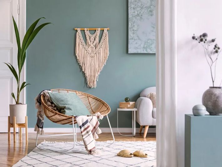
Cool tones can work well in a living room. Picture: Taubmans
Cool colours
Rachel says cool colours can be a good choice for living rooms versus a bedroom, where warmer tones create more comfort.
“The living room is ok being a little ‘cooler’ in terms of colour shades,” she begins. “You don’t need an entire house full of warm colours, it gets too sweet.
“That contrast between slightly warmer colours in the bedroom and cooler colours like greens and blues in the living space works well. ”
Tips for choosing colour:
If you’re not feeling confident on making colour choices in your home, Rachel offered these tips:
- Get help. Help doesn’t have to be from a paid professional. Apps like Taubmans Coloursmith can help with colour selection and creation. Take photos via the app, pinpoint the colour you like (which could be your own twist of one of the 2022 colour trends) and order a sample pot. Easy!
- Have confidence and rest assured. Rachel says in her 30 years as a colour professional, rarely has anyone regretted their decision. “This idea that people paint a room and it’s a big disaster: it doesn’t actually happen. Especially not if you’re talking about soft hues and gentle colours,” she says. “There’s a huge disconnect between how fearful people are [of colour] and then how happy they are with the result.”
- Try samples. Sample pots are a lifesaver when trying to choose colours. Paint big squares on your wall, leave it for a few days and then commit.
Originally published on realestate.com.au as Living room paint colours for 2022.