SHARE

We were lucky enough to talk to Australian interior designer James Treble. James is well-known for his design expertise and presenting Open Homes Australia and Renovate Or Rebuild, both for TV Network 9. James was recently awarded the NSW Fellowship by the Design Institute of Australia for his contribution to the Industry and his involvement with the continuous education of new Designers.
James walks us through his exciting project with the Taubman’s House and his tips and processes for selecting colour palettes.
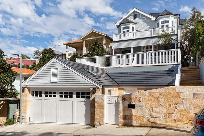
James and the Taubmans House
Back in 2019, James was hired by the family that purchased the house built by Mr Taubmans in 1905. In its backyard still exists the shed where Mr Taubmans first mixed his paints. James was incredibly excited to take on this challenge and invited Taubmans Paint to get involved, noting how relevant the house is to the brand’s history.
"Taubmans is a fundamental part of the fabric of the Australian building and design industry, sporting more than one hundred years of commitment to quality and a diverse range of products for the building and renovation industries."
A family home is also an emotional project to take on, so James had to select a colour palette that suited the heritage demands, but also a look that the current family was going to love for years to come.
"I selected contemporary colours to bring this heritage home into the 21st century."
James's Top Tips for selecting colour
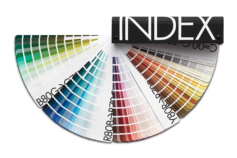
When taking on interior design projects, James is often asked this recurring question.
“With so many colour and finish options available, how do you choose the colours for your houses?’
Interior Design - Selecting Colours
If you're about to start your next interior design project, James has broken down his top tips for selecting a colour scheme:
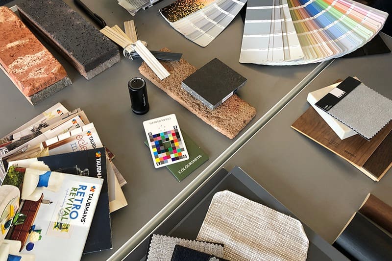
1. Fixed Finishes
- Start by assessing any existing fixed finishes, like flooring or built-in cabinetry and use that as a base for finding a successful colour scheme.
- Look at the colour and finish of other features like the windows, skirting, and architraves, to decide if you wish to contrast them or allow them to blend for a more unified look. Unifying a home with the same skirting and architrave colour gives you freedom to be creative with your décor, while contrasting tones help add interest and character to the property.
2. Style
- If you already have a style or décor in mind, selecting colours that compliment or highlight the styling will be an easy win.
3. Space
- If you wish to enhance the sense of internal space, select lighter tints can help trick the eye. See our blog on using colour to play with space.
- Alternatively, if you want to create a more intimate feel or have a larger space to design, darker shades will work best to add drama and contrast.
- To create an elegant sense of continuity, opt for one main hue to be applied throughout the entire home.
- For some extra character add feature walls or create feature rooms with complimentary and deeper tones.
4. When in doubt think neutral
- Neutral hues are very popular because they appeal to most people and work well with any style of furnishing. If you want to introduce a stronger colour to your neutrals, having an accent colour is a stunning way to add character to your interior space.
Learn the art of practical design
If you'd like to dive deeper into interior design or looking for help designing your dream home, James has created an online design course consisting of 9 themed modules. James breaks down design reasoning of Interior Design, provides practical how-to’s, and shares his insights as an experienced professional and esteemed mentor. See the full course details.
To help you make smarter colour choices and estimate the quantity of paint needed, see our Colour Tools - Taubmans Paints & Colours.