SHARE

Don’t have the luxury of knocking down a wall to increase the size of a room? The next best option is to carefully utilise colour to trick the eye into ‘seeing’ a bigger room.
Choosing the right colour shade for a room can affect everything from the mood and feel to the perceived depth. To ensure you pick the right colour for your room, you will need to factor in which direction your natural light is coming from – as light colour tones are reflective and have the ability to maximise the natural light hitting it. Many people assume painting everything bright white will be a cure-all for space – which can be true under the right circumstances but using a stark white colour in a north-facing room with little natural light can end in a clinical feeling room.
We have broken down the best colours for small rooms based on the position of your window:
Blush Pink
Light colours are an obvious choice when wanting to open a space up but if you are wanting to add some extra depth past the usual white walls – a blush pink is a go-to pick.
This hue is an ideal choice for a room that gets its natural light in the afternoon/early evening. Blush pink will reflect and compliment the sunset tones that light up your room. Paint the ceiling in the same hue for an enveloping feel.
Ideal for: Rooms that get afternoon light.
Our Pick: “Peach Shortcake” or “April Glow”
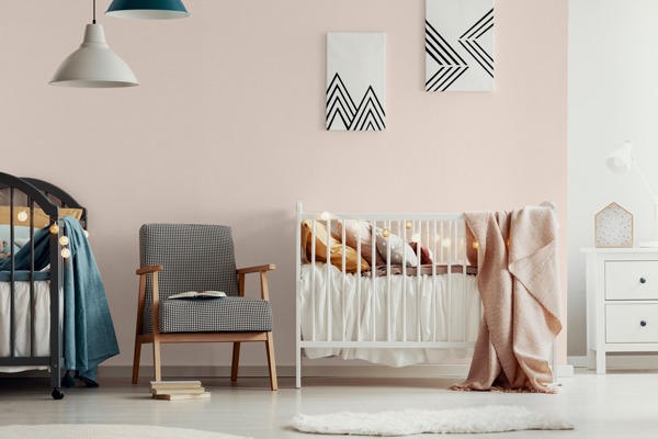
Colour of wall: Peach Shortcake
Shades of White
Painting a space white is an obvious choice in making a room appear to larger. This is a pretty safe bet – especially if your space is bathed in natural light. Selecting a paint that has a low-sheen or semi-gloss will also aid in reflecting light for the appearance of added space.
Ideal for: Rooms with lots of natural light.
Our Pick: “China Doll” or “Aspen Snow”
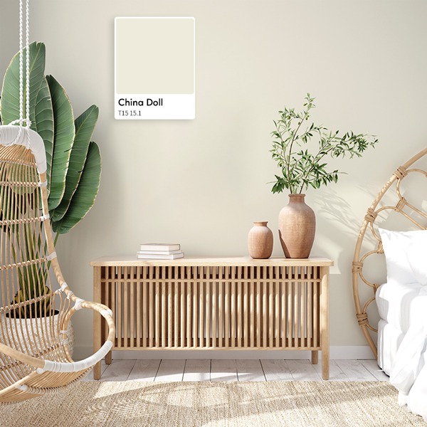
Colour of wall: China Doll
Light Taupe or Cool Grey
If your room has limited architectural details and has clean lines – opting for an industrial look such as a cool grey or light taupe are good options to brighten up a room when you aren’t wanting to default to white. Opting for cooler tones over warmer tones will help make a room feel fresh and clean, opening the space up. This works well for rooms such as offices or living rooms that tend to receive morning/daylight.
Ideal for: Rooms that receive moderate amounts of morning light.
Our Pick: “Movie Star” or "Snow Drop”
Colour of wall: Movie Star
Aqua
Aqua is a wonderful option for rooms that receive a lot of natural light – especially rooms near the water for that added blur between the outdoors/indoors effect. Decorating the space with light timbers and natural fibres will complement the colour palette and help to open the space up.
Ideal for: Rooms that receive moderate amounts of morning light.
Our Pick: “Glacial Lake” or “Twisted Mint”

Colour of wall: Twisted Mint
Now you have selected your colour, an additional tip to give the room the illusion of high ceilings is to paint the ceiling, trim, and doors in the same colour to blur the lines of where the walls begin and end. Next step – calculate how much paint you will need to complete your room and happy painting!
For further inspiration on your colour palettes check out our Pastel Pioneer or New Neutralist look books.